Sunday, February 24, 2013

Assignment 4: Distance Azimuth Survey


Introduction

This exercise was learning the different method for surveying. We were to gather different points using distance and azimuth.  After gathering the points, we imported the table into ArcMap and mapped them out on a base map. We gathered data from two different places. The first was a test run to get us familiar with the equipment. We took points in the back of Phillips, the science building at UW Eau Claire. The second time was at Randall Park located two blocks off of Water Street in Eau Claire, Wi. We gathered 10 points at Phillips and 50 at Randall Park.

Methods

Before going out to collect any points using an azimuth it is important to first discover out what your magnetic declination for your location. Magnetic declination is the angle between magnetic north and true north. The declination is positive east of true north and negative west of true north. You need to know what your declination is so you can collect the right azimuth measurement. Once you get your declination you have to adjust you compass or equipment accordingly. We are lucky here in Eau Claire because our declination is 0° 58' W. This is close enough to zero that it makes no difference.

We went out the first time with the entire class. The purpose was for everyone to get used to collecting points using the lasers before we went out on our own in teams of two. We collected points for two statues, an emergency phone, several trees and a building. Stacy and I used a sonic range finder and a compass to gather our points. Figure 1 shows Stacy collecting our point. It happened to be snowing that day so the visibility was a bit bad. 

Figure 1: Stacy is taking a measurement for a point at Phillips Hall.

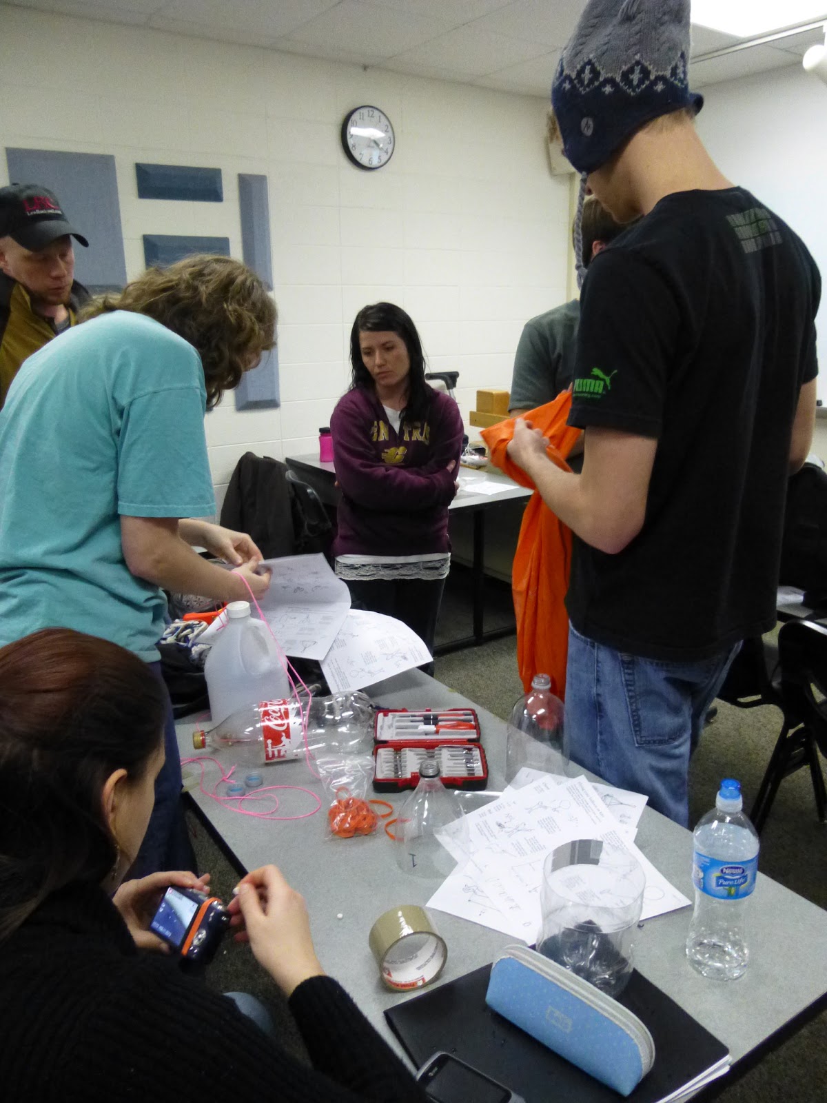
After collecting the points we went back to the computer lab to enter to our data into the computer. We made an Excel sheet that had five attributes (rows). These were x,y (for the lat, long of the origin point), distance, azimuth and point_number. We imported the table into ArcMap. Using the Bearing Distance to Line we made lines showing our data.

However we ran into some serious problems right away. The first time we tried this, we put in a base map right away. This then set our projection for the layer into a projection. This would not work since we were working in lat long. To find out what our origin’s coordinates are, we planned to use the information tool to pull up those coordinates. But with when the base map was put in first, the layer’s coordinate system was set to a projection, which is in meter not lat long. So the very first thing we learned that we had to do was set the layer’s coordinate system to WGS 1984.  This meant we would be working with lat long not meters even when we brought in the base map.

Now that were working in the right coordinate system, we could get the lat long for our origin point. Our origin point was a tree at the corner of the building that we could see on an aerial map. Those coordinates we plugged into the x,y fields on our table. Using the afore mentioned tool we made our lines. These lines ended up in a residential neighborhood not at Phillips (Figure 2). Figure 3 shows where the lines showed up and where Phillips is. Troubleshooting with the entire class, we found out that our problem was not enough decimal points. At first we used only two but we needed six. When we fixed our x,y coordinates, the lines were in the right place (Figure 4). We used the feature vertices to points to add points at the end our lines showing were the object we were mapping was.

Figure 2: This is where the computer plotted our points the at first. This was when our lat long only had two decimals points.

Figure 3: The red dot is Phillips Hall. This is where the lines should have ended up. The red lines is where the computer plotted our data.

Figure 4: Our final map with the lines in the right place.

For the second part of the exercise, we were to go out in teams of two to map a ¼ hectare plot. Stacy and I decided to go to Randall Park as our study area. We chose this place because it was in easy walking distance from campus. This was important because the night before and continuing into the day, Eau Claire had over 4in of snow. We did not want to travel far with the road conditions.
We decided to map all four corners of the park and collect 12 points from each. It was a bit difficult to find a place for our origin because the sidewalks were covered in snow and we could not quite tell where we were. So for two of the corners we used electrical polls and the other two we uncovered the yellow rumble strips of the crosswalks. We switched off between the two of us as to who was calling out the points and who was recording them. At the park we mapped several different features. These features were trees, benches, picnic tables, a statue, lamp posts, and pavilion polls.

Figure 5: Me taking a measurement at Randall Park

Figure 6: Stacy taking a measurement at Randall Park

After collecting our 50 points which took a little over an hour, we returned to campus. We made an excel sheet out of our data using the attributes from before. We went back to ArcMap and got the coordinates for our four different origin points. This time around we had four different coordinates since we took points at each for corner. Using the Bearing Distance to Line tool we mapped out our data (Figure 7).  To show where our features are we used the Feature Vertices to Points tool to make points out of the end vertices of our lines.

Figure 7: Our final map for Randall Park.


Discussion

The first problem we ran into was when we tried to get our coordinates for our origin points. The very first thing we did when bringing up ArcMap was to add a base map. This base map however was in a projected coordinate system that used meters for units. We needed a coordinate system that used latitude and longitude.After much discussion and experimentation with the whole class, we found out the right sequence of events. Before adding the base map you have to set the Layer's coordinate system to WGS 1984. This way when the base map is brought in, it is automatically projected using a geographical coordinate system which uses lat long as units of measurement.

The second problem we ran into was when we tried to plot our Phillips Hall data the first time around. We were only bringing the Lat Long coordinates out two decimal points. This turned out to be not accurate enough. Our origin point and the place our lines ended up were in the same location according to the data we were feeding our computer (-91.5, 44.79). The entire class was ending up with this problem. Our data was ending up all over the place. Again the class worked together to over come this problem. We found out that our x,y points were not specific enough for the computer to plot them accurately. Our x,y points needed to go out at least six decimal points (-91.499602, 44.796467). This way when we ran our tool the lines ended up at Phillips Hall where they belonged.


 As I mentioned before the Eau Claire area had experienced a snow storm earliar that day. Thankfully the snow had mainly stopped by the time we went out. This became a problem when just trying to walk around. There was over 5in of snow on the sidewalks (Figure 8).  It also created a problem when we tried to find spots at the corners of the park that could be found on aerial maps. The snow made it had to tell were we actually stood on the sidewalk. As far as we knew we could have been standing on grass or in the street. We chose to use electrical posts as points of origin. Unfortunately these were only at two of the corners. So for the other corners we uncovered the yellow rumble strips at the end of the sidewalks.
Figure 9: A rough estimate of the height of the snow. The notebook is roughly 5.25in tall.
Figure 10: The footprints show where there is a sidewalk that goes through the park.

Figure 11: The yellow rumble strips
We also had some issues when first importing our data. We found out that we made our table wrong. Some of the lines had the wrong origin points and some had the wrong azimuths. These errors were introduced into our data when we copied it over from paper to computer (Figure 12). The table is not the only place where errors could be introduced. Errors may also occur when using any tool in the ArcToolbox. Figure 13 shows what happens when you input the wrong parameters into the tool. I accidentally but the in the distance attribute in the azimuth parameter.  

Figure 12: This map shows our data with an inaccurate table
Figure 13: The lines are facing the wrong way because the parameters were not entered correctly.
Also we found out that there was a problem with one of points. In the map below you can see that one of the lines shoots far past the park. This happened when trying to collect a measurement for a lamp post. The laser actually picked up the house across the street not the lamp post. The problem was that the lamp post is very skinny and your hand tends to shake when taking a point. The laser went past the post and hit the house. It would have been very nice if we could have had a tripod to use. This way we could have been certain that we got the correct measurement for the feature we wanted.

Figure 14: The line from the bottom right hand corner stretches across the street to a house.


Conclusion

This exercise showed students how one can still collect points without depending on a GPS unit. All one needs is an origin point, some way to measure distance and a compass. Using the distance azimuth methods results with fairly accurate data as long as it is collected correctly.  It also showed us that one has to make accommodations when out in the field depending on what the weather is.

Sunday, February 17, 2013

Assignment 3: Testing for Aerial Mapping


Introduction

This exercise was to help us to prepare and experiment for two of our upcoming activities.  We will be making an aerial map of our campus using a weather balloon and a camera. The other activity is sending another balloon into space and videotaping its flight. We will have a tracker installed with the camera so we can find it after it lands.  However that’s in the future. First we needed to do research and some experimentation to get our rigs ready for the launch. There was a list of things that needed to be down. We all split into teams to work on a separate task. The tasks were constructing the mapping rig and high altitude balloon launch rig (HABL), the parachute needed testing, needed the payload for each rig, figure out how to work the continuous shot for the cameras and how to make sure they did so on the rig, testing the tracking device and figuring out how to fill the balloons and securing them to the rig.  We were encouraged to move between groups so more ideas could be discussed. I mainly worked with the group who was making the mapping rig.  

Methods
Before we started making the rigs, we first had to figure out how to get camera to take continuous pictures. There were three different cameras that we could use and each one had the continuous mode hidden in a different spot.  Once we found the modes, a few people split up to figure how to keep the camera shooting without a person holding down the button.

For instructions on building a mapping rig we were given instructions that were provided with the kit we bought. The materials that we were given was just a collection of random objects our teacher, Joe, thought we would need. Figure 1 shows several of us trying to decipher the instruction that were provided. The problem was that the instructions were basically pictures with very little words describing what to actually do. Click here to see the instructions that we used to help us build the mapping rig. The instructions told us to use a soda 2 liter bottle (Figure 2). It told us to split the bottle in half and use the top half to hold the camera. 


Figure 1: This shows several students looking at the paper instructions on how to build and aerial rig.

Figure 2: This is a picture of a soda bottle like the one we first tried to use for our rig

However we soon found out that this would not work. The cameras that we will be using are two big to fit inside the bottle. Figure 3 shows our group attempting to get the camera into the bottle. Once we could get the camera into the bottle, the bottle was completely deformed and would not suit our needs. At this point our group broke up into two different directions. One group decided to keep trying to make the soda bottles work. Instead of cutting the bottle in half, they decided to flip the bottle horizontally and cut open a hole so they can get the camera in. This rig was duped the Hindenburg.  The other group decided to go in a different direction.

Figure 3: This pictures shows Amy putting the camera into the soda bottle. It also shows Joe, Kent, and Bia looking at the continuous mode of one of the cameras.

We decided to totally forget the about using soda bottles and instead used a cleaning solution bottle that Joe brought in. Figure 4 shows me and Bia getting ready to cut the new bottle in half. As you can see the cleaning solution bottle is much wider than the soda bottle. This allowed our camera to float around in the bottle like it was supposed to. Figure 5 shows the bottle after it was cut.  Now that we had the bottle figured out, we had to work on using the rope to keep the camera in the bottle. 


Figure 4: This picture shows Amy and Bia cutting the cleaning solution bottle in half to build their new rig.

Figure 5: This is the bottle after it has been cut in two.

The instructions suggested using a meter length of rope to use, but this ended up being too short. We found out that using 2.5 meters was long enough for us but the length of rope would change depending on the bottle your using and the camera. Getting the rope on the camera so it could dangle was a little difficult. The first thing was that we had to make sure that the shutter was not covered so the camera could take pictures. The other important factor was making sure the camera was secure and would not fall out. So we first cut our length of rope and tied the two ends together.  Then we pinched it in half so that there were two loops at the end that would help cradle the camera. Figuring that out was not very hard but getting the rope so it would not cover the shutter was a little difficult because our camera’s shutter went all the way to the edge and left no room for the rope. It was decided to loop the rope around the shutter, the shutter was sticking out a bit, and tape it up that way. Figures 6-8 show our final construction of tying the rope to the camera. 
Figure 6: This is the front of our camera withe the rope taped on. It also has the first trigger we built for holding down the button. This trigger is the orange rubber band.

Figure 7: This is how our camera will hang inside the bottle. It will hang upside down just short of the lip of the bottle. Again the orange rubber band is our first attempt of a trigger.

Figure 8: This is what the camera looks like when looking down at it.


Once you have the camera attached to the rope you then put it in the bottle. Pull the rope up through the bottom and out of the top. The camera should be hanging just shy of the edge of the bottle. Say 2 or 3 cm at most. You don’t want the camera to close to the edge because then the camera will not have a clear shot of the ground. Make sure to tie another knot at the top of the rope so that there is a loop at the top. This loop will be used to secure the rig to the balloon.

The next step was getting the camera to take pictures without anyone holding down the button. Bia and others came up with the idea of cutting an eraser down a bit to use as the trigger. They decided to use a rubber band to hold down the eraser so the camera would take the pictures. If you look back at Figure 1 it shows Bia working on getting the trigger to work in the bottom left hand corner. Figure 9a shows a camera with the rubber band and eraser on it. Officially this did work, just not as well as they had hoped.  The problem was getting the eraser under the rubber band. It was quite difficult to get the eraser under the rubber band because it was so tight, but any looser and the rubber band wouldn’t hold down the eraser. When we finally got the eraser in place it would not always work. It would probably work every one out of four times. So instead we came up with the idea of using a larger rubber band and tying a knot in it. This knot would be used as the trigger instead of the eraser.  
Figure 10 shows our rubber band. We tied a knot about a third of the way down. Then taking we would loop the smaller of the loops around the camera first with the knot directly over the button. Then you would take the larger loop and loop it tightly over the knot. Figure 11 demonstrates the final trigger design. 

Figure 9a: This shows our first trigger. It uses a piece of eraser like the one shown below in Figure 9b. A rubber band is fastened around it and the camera so that the button is pushed to take a picture.

Figure 10: This is the rubber band that we will be using as our trigger. It has a knot tied in it about 1/3 of the way down it.

Figure 11: This is our camera with the final trigger in place. We first put the small loop around the camera with the knot over the button. Then take the larger loop and put loop it around the camera over the knot till it is tight and the camera is taking pictures.

After getting the camera and trigger ready to go, we had to finish with our bottle. We had to put some wings on it so the bottle would not spin in the air. The instructions told us to use the remaining half of the soda bottle to make the wings. The lower half of the bottle was not long enough to cut our flaps for our wings, so instead we used an uncut bottle. The instructions suggested using  20cm long and 6cm wide flaps. We were to position them on the bottle angled at a 30 degree angle. We used the measurements provided for us. Figure 12-13 shows our bottle with its wings on it. 

Figure 12: This is our bottle with its wings.

Figure 13: This is our bottle with its wings from a side view.

The instructions said to add another loop of rope to add more security for our camera. You tie a knot in the middle of the rope holding the camera. Loop the second rope through the opening between the camera and knot and thread it up through the opening of the bottle. Secure the end of the rope to a flap at the bottom of the bottle. Figure 14 shows this second loop. 

Figure 14: Rig with the final rope attaching the camera to the bottle.


Our rig is set to be hooked up to the balloon and take aerial pictures of our campus. Using these pictures we can mosaic them together to get a large aerial photo of our campus. This will be interesting because in the last two years we have built a new Student building, demolishing the old and is in the process of building a new education building. Figure 15-16 shows our final rig.

Figure 15: This is our final rig looking at it from the side. It does have the camera inside, you just can't see it very well

Figure 16: This is our final rig looking up at it. It shows our camera being suspended freely inside the bottle.

We will also be sending up anther mapping rig called the Hindenburg. This group used a soda bottle to make the platform. Instead of cutting it in half, they turned it sideways and cut a hole in the side for the camera. Instead of rope to secure the camera, they used zip ties. They also used zip ties to form loops at each end of the bottle so that a rope could be tied there. This rope would then be secured to the balloon.  Figure 17 shows this group cutting a slit in the bottle so that they can insert the zip tie. The Hindenburg has its wings at one end of the bottle. Figure 18 shows these flaps being added on. Figure 19 is a picture of the final construction of the Hindenburg.

Figure 17: The Hindenburg getting its zip ties for the rope

Figure 18: The wings are being added to the Hindenburg

Figure 19: The final design of the Hindenburg.


The video below shows some students testing out the parachute. The bucket has a simulated weight of what it should weigh for the real launch. They dropped the bucket out of a window and let it fall to the ground to make sure the parachute could slow down the weight.


Another group weighed out all the items we would be putting on the HABL. We need these weights to know how large the balloon needs to be. 


Figure 20: Students weighing out the pay load.


Discussion

It took us some time to figure out the continuous mode for each of the cameras. They were each a different kind of camera and had no instructions on how to find them. We eventually found the mode for each camera but it took a while.

 Another problem we ran into was with the instructions themselves. They were very unhelpful. While there were some pictures, these pictures were all in cartoon form and only moderately helpful. Then the words themselves describing the pictures were usually one sentence long and not at all helpful. So as a group we had to fill in the gaps and come up with ways of getting our rig working. This exercises emphasized the importance of working as team to get the job done.

We also ran into a problem with getting a functioning trigger that was easy to use and was reliable every time. The first idea of using an eraser and a rubber band was a good one and in the end it did work to a certain point. But it was not at all easy to use and not very reliable. So after putting our heads together we came up with another idea of using a larger rubber band with a knot tied in it. This idea turned out to be easy to use and quite reliable. This problem taught us if you first don’t succeed try, try again.

One of the main problems we came across in this activity was the lack of good tape. Joe provided us with all the materials he thought we would need. Unfortunately he forgot good tape. He did have some packing tape but it was not very sticky and will not be used for the actual launch. The tape was good enough for use in experimentation though. It was difficult to get our camera attached to the ropes securely. If we bounced the camera around too much the tape would fall off and down goes the camera. For the real launch we will be using much stronger tape like duct tape.

Results

We did all this prep work so that on the day of the launch we will have everything ready to go. There most likely will be some problems that arise but they will be minimized by the fact that we did all this testing beforehand.

Sunday, February 10, 2013

Assignment 2: Refining your terrain survey


Introduction:

This assignment was about uploading our x,y,z data, analyzing it and seeing where improvements could be made. We were to look at how our data came out and then go back out and recollect new data that would better represent our terrain. This exercise was meant to show us that there is always room for improvement and that it is important to always revaluate your data.

Methods:

We first loaded our x,y,z coordinates into ArcMap. From there we made five different interpolation models form the 3D Analyst toolbox of our terrain. These models are IDW, Natural Neighbors, Kriging, Spline, and TIN. Figures 1-5 show the results of these models using ArcScene. With the TIN we converted it to a raster before importing it to ArcScene. After looking at all the different models that we had, our group decided that Spline was the best model for displaying our data.
Figure 1: This is our IDW model of the original terrain model
Figure 2: This is our Nearest Neighbor model for the original terrain data
Figure 3: This is our Kriging model for the original terrain data
Figure 4: This is our Spline model for the original terrain data
Figure 5: This is our TIN model for the original terrain data


Our first terrain model we made out of snow and came back the next day to take our points. However we ran into the problem of the snow melting between the time of creation and the time of collecting points. To get around that, this time we created the terrain then collected the points. Due to the Wisconsin weather, our original model not only melted but was also covered up by about 2in of new snow. This forced us to build a new terrain. We kept our new terrain close to the old one so we could do a comparison.   

Our dimensions for the planter box are 100cm x 230cm. The origin of our planter box is in the lower left hand corner. The grid size is 5cm x 5cm. We tacked on string along the y-axis every 5cm. For the x-axis we put down 2 measuring tapes and had a stick that straddled the box so we could get the points (Figure 6). Me and Joel were down on the ground collecting the data points with Kent upstairs entering the points onto an Excel sheet. I would measure call out the coordinate and depth to Joel, who would tell data to Kent over the phone(Figure 8).
After we collected all the points from our new terrain we imported them into ArcMap and ran the Spline interpolation model on it. As a group we decided that the Spline model worked best for our data. We imported the Spline into ArcScene to show it in 3D model (Figure 9).
Figure 6: Joel waiting to take more points after a brief run inside to warm up
Figure 7: Our method for taking the data points.

Figure 8: Kent entering our data points into Excel
Figure 9: Our final model with the Spline interpolation

Discussion:


Figure 11: Our first terrain.
We ran into some issues with our first model with the cell size that we used. Our first terrain had a cell size of 10cm x 10cm. This turned out to be too large to accurately represent our data. There was a river on the left side of the box running up and down. However it did not show up very well in our original model. There was also the problem that most of our terrain melted the first time around. To avoid that problem the second time, we built the model then immediately took the data points. (Figures 10-11)
Figure 10: Our second terrain.

Figure 12: Our data points from the first terrain
Figure 13: Our data points from the second terrain
Another change we made was the first time Kent wrote down the points on a sheet of paper then transferred them to Excel. This took about half hour; this was with only nearly 300 points (Figure 12). We ran into the problem that as the data was transferred from paper to computer errors would be introduced. Several points were entered wrong and we had to go back and correct them. This time we were going to do a grid with 5cm x 5cm cells, so we decided that it would be easier and faster to just enter the points directly into the computer instead of transferring them between paper and computer. This turned out to be a good idea because in the end we ended up with nearly 1000 points (Figure 13).


Of the interpolation methods we used TIN (Figure 5) was by far the worst. It was blocky and a poor representation. Kriging (Figure 3) was another model that didn’t correctly model our data. The way it showed the difference in elevation was not very smooth. IDW (Figure 1) and Nearest Neighbor (Figure 2) were smoother but you could still tell were the cells were. Spline (Figure 4) was the smoothest of the models.

Results

This was a good exercise. It showed us how to do a survey from start to finish. We had to collect the data points then bring them into ArcMap and run some sort of interpolation on them. This exercise showed a good range of the different interpolation models that one could use. The only down side was the weather. But that is just the way field work is, one has to learn to adjust to the unpredictability of weather. Our group worked well with each other. We all had a job to do and accomplished our task.