Introduction:
This
assignment was about uploading our x,y,z data, analyzing it and seeing where
improvements could be made. We were to look at how our data came out and then
go back out and recollect new data that would better represent our terrain.
This exercise was meant to show us that there is always room for improvement
and that it is important to always revaluate your data.
Methods:
We
first loaded our x,y,z coordinates into ArcMap. From there we made five
different interpolation models form the 3D Analyst toolbox of our terrain.
These models are IDW, Natural Neighbors, Kriging, Spline, and TIN. Figures 1-5
show the results of these models using ArcScene. With the TIN we converted it
to a raster before importing it to ArcScene. After looking at all the different
models that we had, our group decided that Spline was the best model for
displaying our data.
 |
| Figure 1: This is our IDW model of the original terrain model |
 |
| Figure 2: This is our Nearest Neighbor model for the original terrain data |
 |
| Figure 3: This is our Kriging model for the original terrain data |
 |
| Figure 4: This is our Spline model for the original terrain data |
 |
| Figure 5: This is our TIN model for the original terrain data |
Our
first terrain model we made out of snow and came back the next day to take our
points. However we ran into the problem of the snow melting between the time of
creation and the time of collecting points. To get around that, this time we
created the terrain then collected the points. Due to the Wisconsin weather,
our original model not only melted but was also covered up by about 2in of new
snow. This forced us to build a new terrain. We kept our new terrain close to
the old one so we could do a comparison.
Our
dimensions for the planter box are 100cm x 230cm. The origin of our planter box
is in the lower left hand corner. The grid size is 5cm x 5cm. We tacked on string
along the y-axis every 5cm. For the x-axis we put down 2 measuring tapes and
had a stick that straddled the box so we could get the points (Figure 6). Me
and Joel were down on the ground collecting the data points with Kent upstairs
entering the points onto an Excel sheet. I would measure call out the
coordinate and depth to Joel, who would tell data to Kent over the phone(Figure 8).
After
we collected all the points from our new terrain we imported them into ArcMap
and ran the Spline interpolation model on it. As a group we decided that the
Spline model worked best for our data. We imported the Spline into ArcScene to
show it in 3D model (Figure 9).
 |
| Figure 6: Joel waiting to take more points after a brief run inside to warm up |
 |
| Figure 7: Our method for taking the data points. |
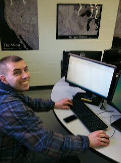 |
| Figure 8: Kent entering our data points into Excel |
 |
| Figure 9: Our final model with the Spline interpolation |
Discussion:
 |
| Figure 11: Our first terrain. |
We
ran into some issues with our first model with the cell size that we used. Our
first terrain had a cell size of 10cm x 10cm. This turned out to be too large
to accurately represent our data. There was a river on the left side of the box
running up and down. However it did not show up very well in our original
model. There was also the problem that most of our terrain melted the first
time around. To avoid that problem the second time, we built the model then
immediately took the data points. (Figures 10-11)
 |
| Figure 10: Our second terrain. |
 |
| Figure 12: Our data points from the first terrain |
 |
| Figure 13: Our data points from the second terrain |
Another
change we made was the first time Kent wrote down the points on a sheet of
paper then transferred them to Excel. This took about half hour; this was with
only nearly 300 points (Figure 12). We ran into the problem that as the data was
transferred from paper to computer errors would be introduced. Several points
were entered wrong and we had to go back and correct them. This time we were
going to do a grid with 5cm x 5cm cells, so we decided that it would be easier
and faster to just enter the points directly into the computer instead of
transferring them between paper and computer. This turned out to be a good idea
because in the end we ended up with nearly 1000 points (Figure 13).
Of
the interpolation methods we used TIN (Figure 5) was by far the worst. It was
blocky and a poor representation. Kriging (Figure 3) was another model that
didn’t correctly model our data. The way it showed the difference in elevation
was not very smooth. IDW (Figure 1) and Nearest Neighbor (Figure 2) were
smoother but you could still tell were the cells were. Spline (Figure 4) was
the smoothest of the models.
Results
This
was a good exercise. It showed us how to do a survey from start to finish. We
had to collect the data points then bring them into ArcMap and run some sort of
interpolation on them. This exercise showed a good range of the different
interpolation models that one could use. The only down side was the weather.
But that is just the way field work is, one has to learn to adjust to the
unpredictability of weather. Our group worked well with each other. We all had
a job to do and accomplished our task.


No comments:
Post a Comment